 | | Andy Snyder
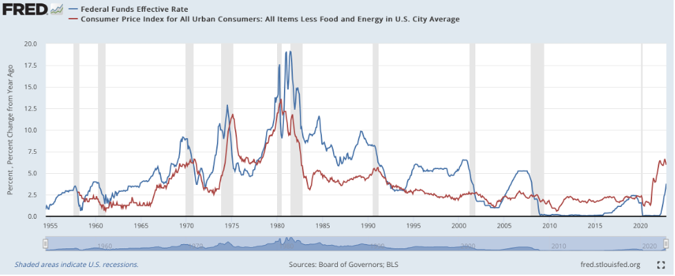
Founder | It's time to take another look at a very important chart. We got a nasty sell-off last week after Jay Powell's "higher for longer" speech. This chart shows us just how high interest rates could climb. More accurately... it shows how high they should climb. [This NEW Electric Vehicle Stock Could Help Fund Your Retirement] Many of our paid subscribers have seen this chart before. It's important. It shows that the market's interpretation of things has been flat-out wrong in recent weeks... and last week's sell-off is not likely to be the last time it misses the mark. Here's the chart... 
View larger image The chart is as simple as it is clear. The red line represents the inflation rate. It shows the year-over-year change in consumer prices. The blue line represents the federal funds rate... the rate Powell and Co. bumped up by 50 basis points last week. A quick glance at the chart shows us that a very important trend has recently turned upside down. It shows that, through much of the last century, the Fed's rate has been higher than the rate of inflation. Inflation roared to life the few times the money maestros fell behind. We see it in the early '70s, when the Fed thought it had beaten inflation and turned dovish... only to get slammed by far worse price growth over the rest of the decade. Now look to the right of the chart... starting with the 2008 debacle and the oft-reported "death of interest rates." With nothing left in its peashooter, the Fed was forced to take interest rates to zero... well below the rate of inflation. The trend has persisted for more than a decade. But now... look at that big spike on the right. Inflation has soared, and the Fed is desperate to catch up. But the gap between the lines remains wide. Powell can't close it. That's why he postured the way he did last week. After inflation figures were released on Tuesday, the market was whispering of a mere 25-basis-point hike, the monetary world's equivalent of a near beer. But Powell said no way. He wanted the hard stuff. He warned that the "terminal" rate could be higher than the market expects. Rates, in other words, could hit a much higher peak and stay at that level for much longer than folks expect. The chart begs us to believe the idea. If it's right, the Fed's rate should be somewhere around 8%, with inflation running north of 7%. But we're at hardly half those levels today. The market wants a pivot. It's pricing one in. But looking at the chart and some simple history tells us a pivot probably isn't coming. Last week, investors got a taste of what fixing the market's mistakes feels like. It hurts. History begs us to pay attention. It's telling us the pivot so many are betting on could be a long - and expensive - time coming. Be well, Andy Want more content like this? | | | | | Andy Snyder | Founder Andy Snyder is the founder of Manward Press, the nation's premier source of unfiltered, unorthodox views on money and what it means for a free society. An American author, investor and serial entrepreneur, Andy cut his teeth at an esteemed financial firm with nearly $100 billion in assets under management. He's been a keynote speaker and panelist at events all over the world, from four-star ballrooms to Capitol hearing rooms. | | | | 


No comments:
Post a Comment